Omegapoint
Omegapoint is one of the market’s leading consultants in cyber security and secure digital transformation. Together with marketing strategy agency Bright Story we were assigned to refresh the brand but keep the existing logo.
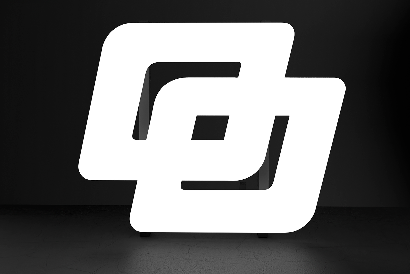
We wanted to inject more life and energy into the brand system while, at the same time, lending it the flexibility to adapt to different target groups such as investors or tech students. The letter O and the full stop from the logo form the new symbol, which also is the basis for the two new characters named ‘Omega’ and ‘Point’.
What we did
Brand platform / Design platform / Design concept / Digital service design / Illustrations / 3D animation
Images from Kidler


